Friday, November 30, 2007

Updated Kristin Card


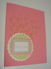
I told Kristin I'd post my version of her card. I added a red layer and some green faux stitching around the blue panel. Hey, I still think it is an awesome card (whether or not you like my version)!

I have a craft show tomorrow, so I will be dropping off the face of the cyber-world for a while.... Anyone in Montgomery County, MD - come out to the Bauer Drive Community Center in Rockville and shop till you drop! ;-) [shameless plug, I know.]


Thursday, November 29, 2007

OK, what do you think?


Here's the new and improved version... or is it??

Snowflake Window


Well, I redid the last one I posted using wintergreen striped paper in place of the blue piece, but it's still not workingn for me so I'm moving on! So, this is what I'm starting. I have used acetate between the layers to suspend the snowflake on (one on each side- offset). I like the window idea and the snowflake in there, but something is missing. Still trying to keep this simple for the large stamp camp I'm doing so I'm trying my hardest to avoid another layer (like where the sentiment is). Does this just need some ribbon and be done with it? Where would you put it? Do you like the colors? I'm avoiding the blue bayou/soft sky combo because I've done that for antoher card. I know this isn't the best picture, but the cardbase is Wild Wasabi and the snowflakes are stamped in bayou and sky...

Oh crud, I just realized I should not even use those colors because then we'll have to share inkpads between projects and I really don't think that would work. Do you have any other colors to suggest? I'm not set on the wasabi... just trying it. What about a kraft base with a ballet blue or brilliant blue snowflake?

Sorry, I'm going on and on...

Am I on the right track?

I only have 1 of this much coveted chipboard bracket. So before I start painting/ altering it, I need to know if I am on the right track as far as my layout. I am happy with the background and the focal image, but I am just not sure what to do with the empty space so I tried the bracket. I am open to any and all changes because nothing is nailed down (or glued down!)

I have tossed 14 cards in the last 2 days because they either had a critical error (smudging, mis-cut, etc.) or they were just so bad and so ugly that I put them out of their misery. Please help me get my mojo back!

UPDATE 12-02-2007
I took this in a different direction. Definitely improvement! Thanks for your help.

Tuesday, November 27, 2007

Here goes...


So, I have a customer who requested I do a "private stamp camp" for her guests this Saturday, doing all Christmas cards. The price point she chose was 5 simple cards and 1 elaborate card for $13. This is one of the cards I designed for her camp which I'm now having second thoughts about.

I really don't want to add too much detail or layers because I'm trying to keep it simple... Oh, and I plan to NOT include the rhinestone brad in the sample I show them (uh, not making enough to give out those precious gems, besides there will be 25 ladies at this thing!).

If this looks familiar, I already posted it to SCS a while back. My suddenly questioning it may have to do with the fact that I designed it so long ago and am just sick of looking at it. Ever happen to anyone else??

By the way, I am totally willing to set this aside and just start over. This is why I usually procrastinate... because I get bored with stuff I did over a week ago!

Thanks in advance, you gals have great input!

Well, here's the second version with Wintergreen. I'm still not sure. I'd like it all without the red flower, but I'm not sure what else to put there... Oh well, I'm moving on to the other design for Saturday. TFL!

{What do you think? }

Good morning everyone. My name is Tracy and thanks to my friend Nancy...I found this great site. I know for one that there is always that card that you just get stuck on and need some expert advise ;0) So here is mine. I have not actually posted this one on my blog yet...cause it needs something. Maybe I should have made the base card bigger? What do you think? Honestly!

New Here

Hi All... my name is Nancy and you can find my blog at Nancy's Creative Mess. I was just approved this morning to take part here at Stamping Critique. What a neat idea.

I posted this card on my blog the other day and while I love the idea of the card, I don't like the card.

I'd appreciate any suggestions!

edit to add: the white dots are Liquid Pearl dots.

Monday, November 26, 2007

My turn... help please!


Hi everyone!

Thanks again for the fabulous idea of this blog.

Here's my card, and please give me some honest advice. I cannot stand this card, I like the color combo, but just can't deal w/ the blah-ness.

Help, help, help!

Critique My Card!


I think it is ok for me to post this card and ask for suggestions. But first let me say what an awesome idea this blog is.

I NEED and want help and would like honest feedback!!

I would like this card to be more "special" -- I like it, but don't LOVE it. Any ideas??

I have no idea if my signature appears below this post so I'll say who I am.

Joan, JoanB on splitcoast and www.paperlicious.typepad.com

Snowman Quandry

I always have trouble with snowmen and blue and white Christmas cards, so I don't know why I bother. I thought this combination might work but it needs something. That's a line of glittered glue (not glitter glue) along the curve in the center and the snowman is embossed with Diamond Sparkle embossing powder. The cardstock for the card itself, and the largest scallop circle, is light blue Bazzill Bling.
Revised card here
I'm open to suggestions! Should I just stick with the traditional colors and quit beating myself over the head with blue and white?? Thanks :-)

Sunday, November 25, 2007

Heavy Metal - Opinions, please

Happy Sunday back at ya!

I started this project a few days ago, then put it aside. I got this far today, then stopped because I think it needs something else, but I am not sure what.


I plan to call it Heavy Metal, because it weighs a ton! I saw the clip tree on SCS, and decided start with that, but to kick it up a bit with some brads from my stash.


I thought I'd play up the purple brads by putting a purple ribbon under the red and green layers, but it looked stupid. Any other ideas? Besides dis-assembling it, that is!

Thanks!


Update: I performed some minor surgery to remove the snowflake brad and replaced it with a bow.

I used a cream ribbon with a gold edge, the better to blend in to the background, but still add a soft touch.


FYI, I am not ignoring the other suggestions, but the way this card evolved (a cheap pack o'circle clips from Staples and a cheap pack o'brads from who-knows-where, and me trying to use up all of them), I do not really have the option of using all the same color brad on one card. Sooo, I've gotta work with what it is, which is why I mixed 'em up. And me, being a little @nal, I had to line them up as evenly as possible on top of the clips. ;-)


This is one with all rust-colored circle clips, where the one above has dark blue. Somewhere lurks one with the olive clips. A totally different look, I think.

Anyway, I am open for more suggestions, including "toss it!" I have a craft show this weekend, and if these can be saved, they will go into sleeves and be inventoried. Otherwise, into the scrap heap.

Happy Sunday!

Hope you all enjoyed holidays dinners and some shopping! A reminder about posting- it doesn't need to be a "finished" creation-- asking about colors, patterns, stamps, embellishments, etc as a part of a project is just fine ;) Everybody has an opinion!