I just wanted to say Happy Whatever-you-celebrate at this time of the year, and to thank our most gracious hostess, Heather, for coming up with this awesome idea for a blog!
I plan to continue to lurk, and post when needed, in the new year. I am grateful for all the honest feedback and great ideas I have recieved here, and I hope more people join our little group in the months to come.
Happy Happy, everyone!
Thursday, December 27, 2007
Happy Holiday/Winter/New Year!
Saturday, December 22, 2007
Penguin adventures - done!
I am playing with my Cat's Pajama's penguins stamp, and I am not sure if I am going in the right direction or not.
First I did this one. For that magical third color I added some Mike's ribbon that had some Teal in it, then used some Teal in the hats. The card is an A Muse 4 1/4 square that I mounted on a 4 1/4 x 5 1/2 piece of card stock so it will fit in a standard A2 envelope without sliding around.

Then I remembered seeing the penguins used separately, so I stamped them separately (they are too close to just stamp once then punch - too bad!) and followed the same theme - A Muse card on a 4 1/4 x 5 1/2 piece of Olive card stock.

Next I used a different A Muse card and mounted it on Blue Bayou, and used a different Mike's ribbon.
I think I like the first one the best. I am seeking opinions on "together versus apart" and also my idea of the A2 base for the A Muse card. Of course, feel free to comment on any other element of these mock-ups. Thanks!
Update 12/23: Thanks for the feedback! Here are versions 4 & 5, one with a blue rectangle and one with green. I tried the green because the blue-on-blue seemed boring. What do you think? Closer?
Update 12/23: Thanks for the feedback! Here are versions 4 & 5, one with a blue rectangle and one with green. I tried the green because the blue-on-blue seemed boring. What do you think? Closer?
Update later 12/23: I guess I should have called this a Card Evolution! I had a DUH moment, and decided since I could not make up my mind between Green or Blue, I did both! Gotta layer! Below is my final version.

Monday, December 17, 2007
What's wrong with the monogram?

 I love the idea of a monogram on this notepad holder but I just can't get it to work. I tried a solid olive too but it seemed blah.
So what kind of a monogram do I need- smaller? and should it be plain or patterned? And should it be somewhere other than the center? 12/21/2007
Here is the after! Thanks for the help
Saturday, December 15, 2007
So I had this idea ... (updated 12/16)
I had to see if these circles were 3/4 inches - and they were! So I had this idea that I could punch them out and raise up a few of them, and I did! Then, as usual, I got stuck. I added the strip of dots on the brown ribbon, then I added the buckle, but I think if I tie a knot it will be just as good. It needs a sentiment, but besides that, what's wrong with this? It needs something... help? 
Quick update: I just added a red layer, and I think it helps, but it still needs something. What shape do you think I should use for a sentiment? Or should I stamp it directly on the paper?

Update 12/16: Thanks for the feedback! I removed the three circles, and to counteract the straight lines, I added a loopy sentiment, and it's not even Christmas-related! I also swapped out the buckle for a knot. What do you think?

Thursday, December 13, 2007
Too harsh?
The following is a comment posted by frequent visitor Paula Kay:
"Moderator.....I am still pretty new to this list so I would like to ask some questions.
Am I being to critical? I thing a lot of times the difference between a good card and a great card is layering. It makes such a dramatic difference. I do not wish to hurt anyone or step on toes. I have noticed that most answers do not really take it as far as I do. Am I wrong in doing so.
I want to be a good stamper and truly want honesty on my card critique but maybe I am being to harsh.....
Please.....give some guidelines to all on the list.
Maybe do a questionnaire type post to see what is really wanted or needed? Thanks so very much for your time."
Wednesday, December 12, 2007
Chris needs suggestions for 130 Christmas cards!
 Our newest member Chris needs some suggestions for her holiday cards. Because Chris is new to blogging, I am posting this for her (at her request!):
"I would like to get some ideas or suggestions on my Christmas card. I
need to send 130 of them so it has to be fairly simple. And quick! I
wanted to use baby blue and either black or chocolate for my cards. I
hope you can give me some ideas. This is a bit outside of my box as I
usually don't like a ton of white space as I have on this card. You
can't see it in the picture but the colored cardstock has pin dots in
the top and bottom."
Recipe:
All supplies Close To My Heart
Playful Flourishes stamp set
Winter Reflections stamp set
Jingle Borders stamp set
Sparkles
Heavenly Blue cardstock and stamp pad
Black cardstock and marker
Or Chocolate cardstock and marker"
Friday, December 7, 2007
Rescue me! (Rescue was a success!)
 Help me! I am an unattached card looking for a new image. My owner (a very beautiful and talented artist in her own right) has tried a large bold rose, a smaller bold rose, a daisy and my current image. We just aren't sure what style or type of flower would work best with me (we own LOTS flower images). We really like the rest of me but we are willing to make changes for the same of art!
PS I also like pina coladas, getting caught in the rain, I'm not into health food but I'm into champagne!
12/08/07- Completed card on the right for a tutorial on my blog

Thursday, December 6, 2007
Two-fer - UPDATED!
I decided to go for a two-fer! Two ideas in one post. :-)

First, this is yet another (and my last!) version of this card - I changed the layers for the sentiment. Fewer layers, and the red is more prominent. Done!
Update: I also thought I'd give the ladies the option of hanging a thread around one of the shrimp's necks with a little bell on it. Too much? Ya think? ;-)

This is the card that needs help! I need a fifth project for this weekend's classes, and I decided to do a snow theme instead of Christmas. I thought I'd try the suspended image in the window, and I really like it.
The "typically me" part is where I get the colors right and the technique seems to work, but I have no clue how to finish the card!
Any ideas? The paper is pretty busy, and I'd like the focus to be the suspended image.
FYI - Base is Soft Sky, snowflake is stamped on Whisper White with Sage Shadow ink, punched out with the snowflake punch, frame layer in the window is Basic Gray (all by SU).
Thanks!

UPDATE! I added some vertical ribbon, red glitter in the center of the snowflake (my customers will be using a glue dot instead of 2-way glue so theirs is actually round ...), and a sentiment stamped in Basic Gray.
I decided to not overload them with additional glitter on the snowflakes ... one mess is enough!
Thanks for the great ideas!
Tuesday, December 4, 2007
Which one? - Updated!

I like this card, but I am not so sure about the layers of punches with the sentiment. Nothing is nailed down yet, but I do plan to put gold brads in the oval to embellish the sentiment.
Then I thought instead I'd "fold down" the corner and use the Round Tab punch for the sentiment instead. Again, it will have gold brads holding it in place.
Which do you like better? Or is there a third option? (Of course there is! LOL!) OMG, I just realized I did not use any ribbon ... yet. ;-)
Here's my updated version:

In addition to sticking eveything down, I put in the brads and added some glitter to the shrimps' antennae. Do you think it will pass muster for a class this weekend?
Following the Holiday Trend Before... and After
 I really, really like the "forest of trees made with DP" style holiday cards that have been posted all over the place. This is my attempt.
I think I have the right idea and I like how the moon reflects on the dusting of snow on the ground but I'm wondering if the DP on my trees is too boring?
Go ahead- do your thing with my card!
Update: 12/05/07 12:30pm
Here is the new and improved version. I made my snow brighter, chose some bolder patterned paper, skinnier tree trunks, a smaller moon and some bling for the treetops! Thanks for the help!
Monday, December 3, 2007
Snowman update
Alrighty, here are the finished cards. I may actually make a few more like this and maybe some red and green ones with a tree instead of a snowman! Thanks for all of your comments.
Original card here

Saturday, December 1, 2007
Card Box

I found this pattern for a really cute card box and I gave it a try, but I'm just not sure about it. The base of the box is old olive, but I'm wondering if I should have used Really Rust instead. I sponged all of the edges with Really Rust and then added faux stitching with my Chocolate Chip pen.
I'm not sure if the strip of DSP around the top of the box is too "clean" looking--in other words there's too much white in it. I tried to tone it down by adding ribbon.
I don't know. What do you think? Am I just being too picky and it looks fine? Or does it really need some work? Please be honest. Thanks!
Dannie Graves
Friday, November 30, 2007
Updated Kristin Card

I told Kristin I'd post my version of her card. I added a red layer and some green faux stitching around the blue panel. Hey, I still think it is an awesome card (whether or not you like my version)!
I have a craft show tomorrow, so I will be dropping off the face of the cyber-world for a while.... Anyone in Montgomery County, MD - come out to the Bauer Drive Community Center in Rockville and shop till you drop! ;-) [shameless plug, I know.]
Thursday, November 29, 2007

Snowflake Window

Well, I redid the last one I posted using wintergreen striped paper in place of the blue piece, but it's still not workingn for me so I'm moving on! So, this is what I'm starting. I have used acetate between the layers to suspend the snowflake on (one on each side- offset). I like the window idea and the snowflake in there, but something is missing. Still trying to keep this simple for the large stamp camp I'm doing so I'm trying my hardest to avoid another layer (like where the sentiment is). Does this just need some ribbon and be done with it? Where would you put it? Do you like the colors? I'm avoiding the blue bayou/soft sky combo because I've done that for antoher card. I know this isn't the best picture, but the cardbase is Wild Wasabi and the snowflakes are stamped in bayou and sky...
Oh crud, I just realized I should not even use those colors because then we'll have to share inkpads between projects and I really don't think that would work. Do you have any other colors to suggest? I'm not set on the wasabi... just trying it. What about a kraft base with a ballet blue or brilliant blue snowflake?
Sorry, I'm going on and on...
Am I on the right track?
 I only have 1 of this much coveted chipboard bracket. So before I start painting/ altering it, I need to know if I am on the right track as far as my layout. I am happy with the background and the focal image, but I am just not sure what to do with the empty space so I tried the bracket. I am open to any and all changes because nothing is nailed down (or glued down!)
I have tossed 14 cards in the last 2 days because they either had a critical error (smudging, mis-cut, etc.) or they were just so bad and so ugly that I put them out of their misery. Please help me get my mojo back! UPDATE 12-02-2007
I took this in a different direction. Definitely improvement! Thanks for your help.
Tuesday, November 27, 2007
Here goes...

So, I have a customer who requested I do a "private stamp camp" for her guests this Saturday, doing all Christmas cards. The price point she chose was 5 simple cards and 1 elaborate card for $13. This is one of the cards I designed for her camp which I'm now having second thoughts about.
I really don't want to add too much detail or layers because I'm trying to keep it simple... Oh, and I plan to NOT include the rhinestone brad in the sample I show them (uh, not making enough to give out those precious gems, besides there will be 25 ladies at this thing!).
If this looks familiar, I already posted it to SCS a while back. My suddenly questioning it may have to do with the fact that I designed it so long ago and am just sick of looking at it. Ever happen to anyone else??
By the way, I am totally willing to set this aside and just start over. This is why I usually procrastinate... because I get bored with stuff I did over a week ago!
Thanks in advance, you gals have great input!
Well, here's the second version with Wintergreen. I'm still not sure. I'd like it all without the red flower, but I'm not sure what else to put there... Oh well, I'm moving on to the other design for Saturday. TFL!
{What do you think? }
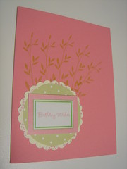
Good morning everyone. My name is Tracy and thanks to my friend Nancy...I found this great site. I know for one that there is always that card that you just get stuck on and need some expert advise ;0) So here is mine. I have not actually posted this one on my blog yet...cause it needs something. Maybe I should have made the base card bigger? What do you think? Honestly!
New Here
 Hi All... my name is Nancy and you can find my blog at Nancy's Creative Mess. I was just approved this morning to take part here at Stamping Critique. What a neat idea.
I posted this card on my blog the other day and while I love the idea of the card, I don't like the card.
I'd appreciate any suggestions!
edit to add: the white dots are Liquid Pearl dots.
Monday, November 26, 2007
My turn... help please!
Hi everyone!
Thanks again for the fabulous idea of this blog.
Here's my card, and please give me some honest advice. I cannot stand this card, I like the color combo, but just can't deal w/ the blah-ness.
Help, help, help!
Critique My Card!

I think it is ok for me to post this card and ask for suggestions. But first let me say what an awesome idea this blog is.
I NEED and want help and would like honest feedback!!
I would like this card to be more "special" -- I like it, but don't LOVE it. Any ideas??
I have no idea if my signature appears below this post so I'll say who I am.
Joan, JoanB on splitcoast and www.paperlicious.typepad.com
Snowman Quandry
I always have trouble with snowmen and blue and white Christmas cards, so I don't know why I bother. I thought this combination might work but it needs something. That's a line of glittered glue (not glitter glue) along the curve in the center and the snowman is embossed with Diamond Sparkle embossing powder. The cardstock for the card itself, and the largest scallop circle, is light blue Bazzill Bling.
Revised card here I'm open to suggestions! Should I just stick with the traditional colors and quit beating myself over the head with blue and white?? Thanks :-)
Sunday, November 25, 2007
Heavy Metal - Opinions, please
Happy Sunday back at ya!
I started this project a few days ago, then put it aside. I got this far today, then stopped because I think it needs something else, but I am not sure what.
 I plan to call it Heavy Metal, because it weighs a ton! I saw the clip tree on SCS, and decided start with that, but to kick it up a bit with some brads from my stash.
I thought I'd play up the purple brads by putting a purple ribbon under the red and green layers, but it looked stupid. Any other ideas? Besides dis-assembling it, that is!
Thanks!
Update: I performed some minor surgery to remove the snowflake brad and replaced it with a bow.
 I used a cream ribbon with a gold edge, the better to blend in to the background, but still add a soft touch.
FYI, I am not ignoring the other suggestions, but the way this card evolved (a cheap pack o'circle clips from Staples and a cheap pack o'brads from who-knows-where, and me trying to use up all of them), I do not really have the option of using all the same color brad on one card. Sooo, I've gotta work with what it is, which is why I mixed 'em up. And me, being a little @nal, I had to line them up as evenly as possible on top of the clips. ;-)
 This is one with all rust-colored circle clips, where the one above has dark blue. Somewhere lurks one with the olive clips. A totally different look, I think.
Anyway, I am open for more suggestions, including "toss it!" I have a craft show this weekend, and if these can be saved, they will go into sleeves and be inventoried. Otherwise, into the scrap heap.
Happy Sunday!
Hope you all enjoyed holidays dinners and some shopping! A reminder about posting- it doesn't need to be a "finished" creation-- asking about colors, patterns, stamps, embellishments, etc as a part of a project is just fine ;) Everybody has an opinion!
Thursday, November 22, 2007
Those Darn Corners!
 I made a bunch of these yesterday, and decided to try one with this Psychadelic (sp?) paper. The Parent Sheet is huge and it makes my eyes swim! I love the colors, so I gave it a shot.
All the other ones I made (you can see them in my SCS gallery) have green in the paper, so I stamped some holly in the top corners to fill them in. THIS one, however, is just purple and yellow, and I did not think anything green would work.
As you can see, I opted for some doodling around the edge, which I liked, but those darn corners still looked bare. I ended up just using my Elegant Eggplant marker and the Paper Piercing template to make some dots.
I am not happy with the result. I thought about using brads or something, but the star at the top of the tree kinda killed that. Any other ideas? Thanks!
PS: Could the original poster please tell us how she got the picture so large? This is one of my struggles ... thanks! ;-)
UPDATE:

I have redone the card, incorporating some of the great suggestions. Please ignore the smudges ... I have a bandaid on one of my fingers, and it messes up everything I touch. I think I'll wrap my left arm in plastic before I touch any more card stock.
ANYway, the tree is on Eggplant, the next layer is Shimmer Gold, and I wrapped some gold cord in the left corner and tied it into a bow. The bow is held in place by a balled-up glue dot (now you should understand the smudges ...). That whole thing is layered on more Eggplant, then the base is Barely Banana. I gold-embossed the sentiment in the bottom right corner to balance the bow.
Am I closer?
BTW, I thought it was a better idea to update my original post than to start another one, just to keep my versions together. What do you all think about this idea?
Merry Christmas
I made this late last night and am not sure if it works or not. I love the red and green flower and had no idea that suede paper would look so gorgeous run through a CB embossing folder, but it's the sentiment I am not sure about. What do you think??
Wednesday, November 21, 2007
Here we go!
 This is not a finished card (or even close). I am trying to develop a prototype sketch for some holiday cards. I like the 3 ornaments and thought the card needed something in the upper left corner... So as far as the layout goes- would this be better without the snowflakes in the corner? PS I know my ornaments are missing hangers... they will be added in the next version. I'm trying to figure out if my center ornament is too heavy and just not working.
 Here is an improved version, incorporating some of the great suggestions I received (thanks), but I have made an observation about myself: I simply HATE to make Christmas cards. While you would never know it at it- I spent 2 hours on that revised card- and I still don't like it much. but I learned something from the process-- I am going to stop kidding myself- I simply HATE the holidays.
Tuesday, November 20, 2007
Update!
So far so good- several artists have contacted me to accept the challenge to improve their art and critiquing skills! Those who have sent me (Heather) an e-mail have been sent an invitation to join the blog so they can post their art to the blog. And as someone asked- you will only be able to edit your own posts.
Feel free to link to this blog in your blog.
If anyone has a desire to create a blog banner, I would love to add it to the list of "ways to beautify the blog!"
Does anyone have any ideas for tags? Maybe keep it simple like: card or scrapbook, artist name? Let me know what you think.
Tuesday, November 13, 2007
Welcome to Stamping Critique
After blogging (posting and reading) blogs for over 2 years, I have become cynical. Is a card or scrapbook page good because 5, 10, 15 or 30 people gush about how good it is? Or is a piece not so good if it doesn't get any comments? So I started the Stamping Critique blog.
How honest are we commenting on our cyber friend's blogs? What if you had a place to post your artwork so people could honestly comment on the good, the not quite as good or a place to request help or suggestions for improving your artwork.
What if you had a place where you could comment and give your honest feedback- good and not so good about your fellow artist's work? A place to provide constructive criticism to your fellow paper artists. Please send a request to join to: stamping.critique@gmail.com
Subscribe to:
Posts (Atom)
