Hi everyone!
Thanks again for the fabulous idea of this blog.
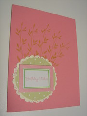
Here's my card, and please give me some honest advice. I cannot stand this card, I like the color combo, but just can't deal w/ the blah-ness.
Help, help, help!
Monday, November 26, 2007
My turn... help please!
![]()
Subscribe to:
Post Comments (Atom)

10 comments:
I love love the stamping on the background under the circle. It is perfectly placed and a great idea.
However, I think the scale of the focal image is off. Maybe. Try making the circle and scallop a bit smaller and using solid instead of patterned paper. I'm not loving the rectangle on top of the circle. I think it doesn't blend with the style of the background, which is soft. Maybe the sentiment needs to be in a circle as well?
Honestly, I'm making this stuff up. I'm just going by my gut. Hope this helps.
I think this should be two different cards...Love the stamping on the background, but doesnt seem ( to me) to go with the scallop & sentiment...Scalloped circle should be solid pp...and adding ribbon somewhere always seems to help....I love textiles!
I don't think the rectangle over the scalloped circle "works". I'm with Joan- it doesn't fit the rest of the curves and such on the card. I think another circle for the sentiment would look better.
I might be in the minority but the background stamping isn't working for me yet but as you develop the card it might grow on me ;)
Cool concept. I would stamp the background with canvas or linen, to soften the other images, mabey even sponge ink the edges of the card.
Second I would make the sentiment block a smaller rectangle and move to the lower right.
Third I would add a flower image to the now empty circle.
I like the color combo alot, but I have to agree with the others - I'm not crazy about the rectangle either. The background stamping is a good idea, but what about something more flourishy and random - maybe even stamped with Versamark or the same color ink as the cardstock. I also agree with everything Maureen said. Just my two cents :-)
I too like the colour combo but wonder if it would be better if the pink wasn't the card base.... maybe play around with the same colours in different combinations in your layers
I love the color combo and your stamping, but the scallop circles under the rectangles does not seem to flow. I would add another mat to the rectangle and remove the circle matting. Just shooting from the hip, hopes this helps,
I like what flossie said, maybe you could move the sentiment rectangle to the bottom right and have the branches come out of there.
Thanks guys, I'm loving the comments, gotta sit down and revamp!
Keep them coming!
Here's my 2 cents worth...
I don't think I mind the rectangle on the scallop, but I think I'd leave off the celery dotted circle on top of the scallop (it seems too big for the scallop, and not quite the same color as the rectangle outline).
Also, the thing about the stamping under the scallop that doesn't work for me, I think, is the color of ink on the paper. I think these colors can work together, but the ink changes on the paper and doesn't come out the same as it would on white or other more neutral. If you do decide to restamp on another color see if maybe you can stamp them a little more "imperfectly" you know, like a tiny bit more random or overlapped a bit for a more natural look.
Good luck- you've been given tons of ideas, can't wait to see what you come up with!
Post a Comment