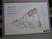
I made this for next weekend's workshops. I like the colors I used - the blue layer draws out the sponged sky, and the Kraft base ties in with the brown hair color. I purposely left the white clothing so it was not too busy. And I wanted to keep it soft because the watercoloring on watercolor paper is a soft look.
I still think it needs something, but I am not sure what. Naturally I thought about ribbon ;-) but where? Brads? Where?
Help!? Thanks!
Update: I added a Basic Gray layer (softer than Black, and I was not sure Choc Chip would work). I decided the shell in Crab & Co was too cartoon-y, so I opted for HPH with ... a bit of ribbon!
 Whatdyathink?
Updates 2 & 3: I carefully pried off the glue dot under that clip and it still took a bit of the paper with it. Please ignore. The image on the left is the same as the one above minus the clip. The image on the right has some brads. I think they may still be a bit too heavy, though. Maybe a lighter color brad?


Someone commented on the size of the watercolor paper. I'll play with that next (at the risk of filling up blogger with snapshots.) ;-)
Last update - no pic: I changed out the brass brads for some soft blue ones, and I like the look. Thanks for all your input!

6 comments:
The image and watercoloring looks fab. I think your blue layer get lost against the kraft colored layer. I would like to see a darker layer in place of the blue.
I am the queen of underembellishment. What about a natural embellishment- bark, a skeleton leaf- something with some texture? A shell button?
Cool ideas, but it's gotta be SU. Maybe I can stamp the shell from Crab & Co and cut it out. I might also try a darker brown layer.
3 brads on the lower right side would maybe add balance. I do agree with whomever, about the Kraft card base. I LOVE navy blue with the pale blues...*hint*....that would require a white paper insert inside for your verse.......or maybe a very pale blue paper insert.......
BUT seriously, something simple like the brads, just for balance.....I do love your coloring....AND the pale blue. Let us see what you do in the end.
I love your image and watercoloring and I love the card with the added Basic Gray layer. I think that I would leave the HPH and ribbon off though. The couple is having a special moment and adding the embellishment just draws attention away from them in my opinion.
If you really want to make the people pop, then make that layer smaller and add a layer or two behind it in the smaller size. That would automatically draw your
eye to the people. You could also set your people to the right or left side and add your embleshments to the other side.
My vote is to use your original- it is lovely and soft and romantic looking. Seems to be a Workshop WOW in my opinion, very easy to duplicate and very nice without any embellishments at all. That is what really impresses workshop guests a lot of times! TFS!
Post a Comment